
Pathify is committed to providing users an interface matching the world’s leading B2C applications with the most modern, engaging and seamless user experiences in higher ed. As part of this commitment, we’re in the process of improving our user interface once again, to minimize cognitive load for students and provide admins with more flexibility in their portal configuration than ever before.
The first phase of this release rolled out to customers on May 3 and included a number of critical updates. First, we consolidated the Main Menu into a single, scrollable list. Now everything smoothly scrolls together without jumping between menus. It is now wider with larger fonts and badges providing more space and simplicity in the navigation.
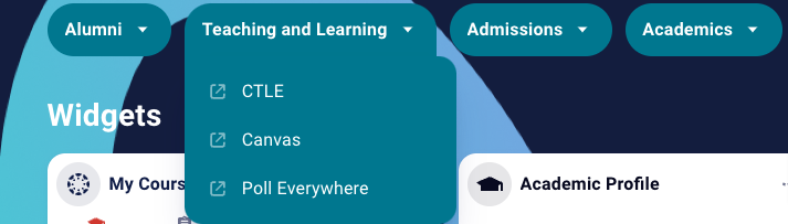
In addition to these changes, we added customizable text and background colors controlled on the Self Service Branding page with the ability to hide the menu altogether, if the user chooses. Here are a few examples of how the new menu looks:
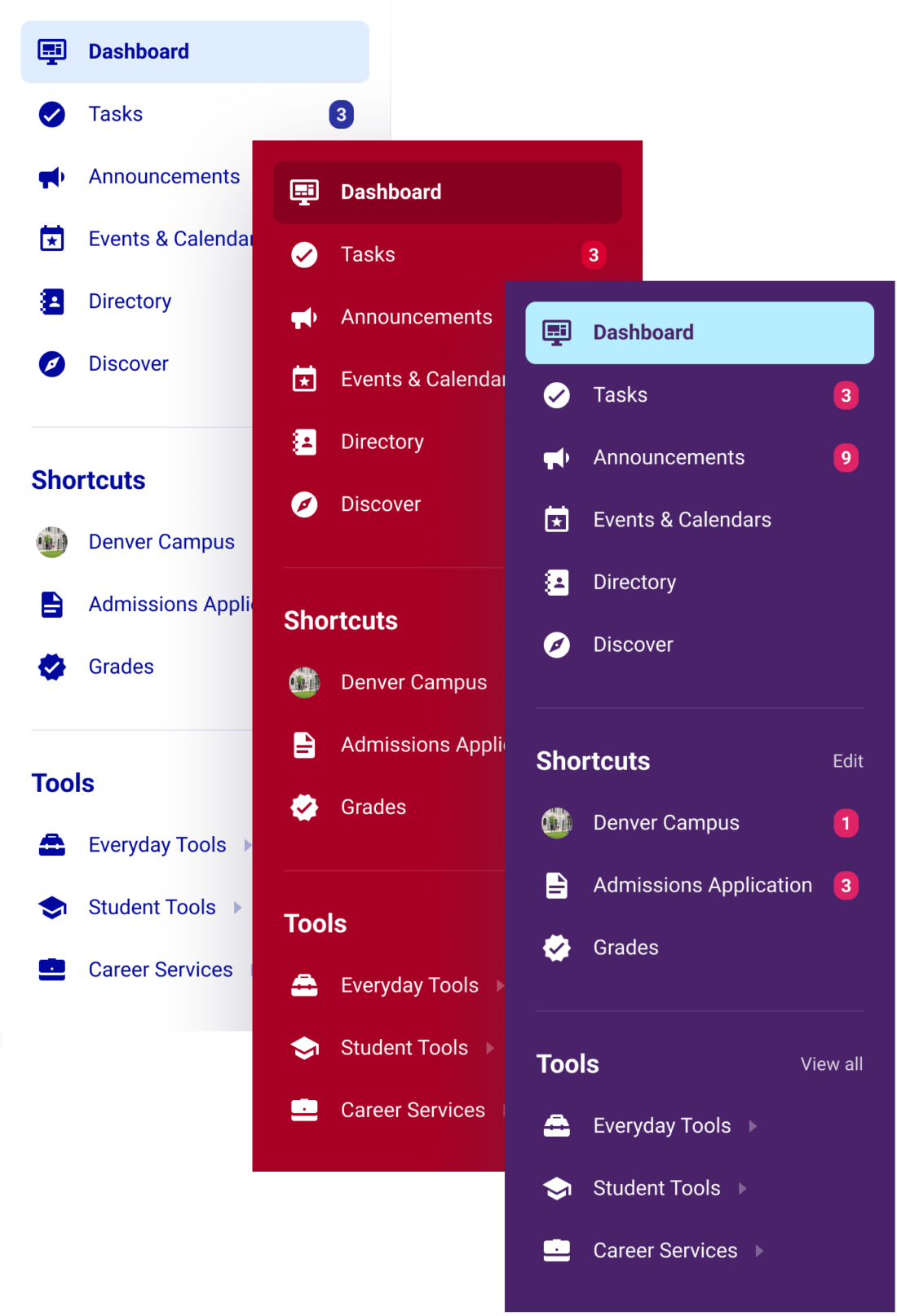
Next, we added a customizable dashboard background. The new capability offered in Self-Service Branding lets institutions seamlessly tie-in their color palette and branding by adding a background image to the dashboard with an overlay of any color. We also changed Quick Links to be displayed as ‘capsules’ with unlimited links and branding options available.
In Phase 2 (slated for early July), we’ll feature a cleaner mobile experience with the ability to fit three items across the screen and widget folders to create a more organized layout based on the admin’s or user’s preferences. It will make the interface look similar to the way many students currently interact with their mobile devices — fully customizable and intuitive to find exactly what they need!
Expect to see even more enhancements helping students find exactly what they need while decreasing cognitive load as the Summer progresses. Take a tour of the new UI included below, or book a demo to see why customers rave over our enhanced experience.